Monday 29 February 2016

Double page spread Analyse

I am going to be looking at another Mojo music magazine double page spread. This is because as Mojo is one of the main music magazines I am going to be looking at I want to be getting the most ideas from it.


This is the double page spread from the Mojo music Magazine. The first thing that is obvious is the Gothic them going on. Firstly the fonts used really help to support the Gothic theme. Firstly the main title which reads "American Gothic" is written using two fonts that do look very Gothic and I instantly saw that. The "I" at the start of the paragraph also is written in a Gothic font. It looks like a grave stone or something Gothic. This is really god because firstly is draws you instantly to the article itself but also it helps to portray the theme wanted. The main text is written in neat font reasonably sized meaning that people can easily read the information. The main background colour for this double page spread is black. This again supports the Gothic theme. This is because it reminds you of horror and mystery. The main text and some of the titles coloured white. This is an obvious choice because it stands out so well against the black background. There are also some brown highlights in the text. This helps to stick to the theme of dark colours and also the colour inks in well to the dark coloured Gothic theme. The main image covers all of the right page and a bit of the left page. It is a medium close up an slightly tilted. The background is a Gothic one of a church making us think of grave yard. But the model is what interests me. This is because he seems relaxed and happy to be there. This makes us feel that he is all up in the Gothic theme and likes it.

The first thing that I saw and like from this double page spread is the way that there is a consistent them going on throughout the double page spread. This is good because it means that there is something to base the double page spread on and it looks themed. This can be more attractive for people. I also liked the way that there is fonts used that go with the theme. This helps to link the magazine to the main theme and also helps to make the magazine look a lot better.    

Double page spread Analyse

I am going to be looking at another double page spread. This is to give me a good idea of what a double page spread should include. I am going to be looking at a double page spread from the music magazine Classic Rock. This is very much in my theme of classic rock/Indie.


This is a double page spread found from a Classic Rock music Magazine. The first thing that really stands out to me is the main model in the centre, well there about. He seems to be jumping through the air in quite an iconic rock position. This position is him jumping as if he were playing the guitar but with a broom. The reason why it stands out is because it is something different. Something that we wouldn't usually expect to see and this makes us attracted to it, we want to look at it and learn more from it. This image is good to use for a main one because you are instantly attracted to it and you want to look at it, meaning you are attracted to it. There is then a second image in the bottom left corner. This image is a lot smaller than obviously the main one but is still good. This is because it is another image that can attract people to the magazine. The image includes two models. These images have obviously been taken on a different background to the one that they are on. This means that they will have been cut out using Photoshop. This is a good skill that I will have to make sure I know how to do and use. The background colour is a white/ blue colour. All the other colours stand out well against it. he main title is located at the top of the left side of the page. It is slanted to the left a bit which makes it more interesting for viewers and readers. It is written in quite an iconic font which is new and something that probably most people wouldn't have seen. This again makes it into something that can attract people. It is coloured red with almost a blood affect. This is interesting because this is something we wouldn't associate with the classic rock genre. The normal text is in a standard neat font and is easy to read. It follows in neat columns. It fits around the images also. It is shaped around them making the images stand out more.          

The first thing that I like from this double page spread is the odd picture. This is because I think by using an image like this it will help to attract people to want to read the magazine because it is something they haven't seen before. I also like the way that the font has been shaped around the images. This helps to make the images stand out more and also it looks a lot more neater than just having everything in straight columns in there own separate place. 

Sunday 28 February 2016

Double page spread Analyse

I am going to be looking at another Mojo music magazine double page spread. This is because it is part of my main them so I think it fitting that I look at this again to try and get as much ideas I can.


This is the double page spread from one of Mojo's music magazines double page spreads. As you can see the first thing that really stands out is the main image. This is normal really because it is what is expected from a main image. It is really in your face straight away. It is a close up meaning that you can see a lot of detail from the face of the model. I think this is what makes people's eyes drawn to it so much. Again this image looks like it is coloured in grey scale. This is because it is very white and black. It fills the whole of the right side of the page and some of the hair comes onto the left side of the double page spread. The left side is where most of the text is. The first bit if text is the main title. This is in front of the main image because you can see the way that the hair is behind the title. The title stands out very well because of the font used and also the way that the text has been positioned. The main text and story follow bellow. This font is a little smaller but is still visible to read. It is again black which like the title looks good because it stands out against the white/grey background used. There is again a letter at the start of the paragraph which is enlarged. This again make it look a lot better and helps to make it stand out more.

The first thing that I like is the way that there is a close up used. I think close-ups really help to draw people in because they are so in your face and you can see all of the facial expressions on display. It might not be my main image but I think definitely a close up will feature on my double page spread. I also like the way that there is a good background colour which allows information to stand out against it. A good background colour is crucial because it helps images and text stand out very well.  

Double page spread Analyse

I am going to analyse another double page spread but this time instead of looking at a magazine that links to my main theme I am going to look at a magazine from another genre of music. I am going to look at a double page spread from the music magazine Kerrang. The main theme from this kind of Magazine is metal rock. I will see if there is anything that I like from this kind of magazine.


This is the double page spread from the Kerrang Music Magazine. The first thing that I noticed was the colour scheme. A bit like Mojo there is a frequent colour scheme going on in this magazine. The three main colours are black, white and red. These colours all look good against each other and stand out. They also link into the main theme of the metal music because these are colours that we would associate with the metal kind of music. This is because they are dark. All of the main images are in a grey scale affect making them link to the main colour scheme again. This is because they look quite white and black. On the left side of the double page spread the main image is situated. It takes up most of the bottom of the page and goes quite far up the page. There isn't a lot of text on this page. A bit of the title stretches over onto the page and there is some things above the main image. There are also four little pictures all along the bottom of the page. The first one is on the left page but right at the end in the far right. There are then three more going across the right page. They all look to be the same size which makes them look better and neater. Above the images is the main text. This is written in a very small font so actually looks quite hard to read and people might actually struggle to read it. It is coloured white so stands out very well against the black background that it is against. This can make the text easier to read for people. Again like the last double page spread there is a letter that is bigger at the start of the paragraph. This coloured red which follows the main colour scheme and also stands out against the black background. The title is slanted a bit to the left. This makes it stand out more to people I think and it looks a lot more attractive for reader's. It is coloured in the main colour scheme of red and white. It is big enough to stand out and is easy to read.

The first thing that I like from this Double page spread is the way that there is a continuous colour scheme going on throughout the double page spread. The three colours are red black and white and all three of these colours look good together. I think that the main thing that is going to be included throughout this magazine is a continuous colour scheme. This is crucial because it helps the magazine look good. I also like the there are four little mini images along the bottom of the page, This helps to add more to the page. I will definitely be using more than one image on the double page spread.     

Tuesday 23 February 2016

Double page spread Analyse

I am going to look at and analyse a double page spread from a Mojo music magazine. The reason why I am looking at Mojo is because it is the main magazine that I am looking for because it is the perfect theme. This theme is Classic Rock/Indie music. I am going to look at all of the features on the magazine and discuss what is good then tell people what I like about it.


This is a double page spread from the music magazine Mojo. As you can see it includes a main image which is located mostly on the left side with a bit going onto the right page. There is then some text, well quite a lot of text on the right hand side. There is also a large title above the text. The first thing that I notice is the main image. This is because it is big enough to stand out to people but also the colours help to attract the eye. This image is fully coloured. Also the way that the models are positioned is good. This is because the main man is in front, and his head looks dead centre with the left page. This means eyes are drawn to it. There are then three more models standing behind the main one. This again means that there is something for people's eyes to be attracted to. All of the models eyes are directly staring out at you. This could again help to attract people to read the magazine. The main title is nice and big meaning that it stands out to people easily. The normal text is also a good size, it is easy to read and looks good against everything else. There are also some big letters at the start of some of the paragraphs. This helps them stand out and also looks good and conventional. They are also coloured blue which stand out and looks good against a white background.

The main thing that I like from this double page spread is the way that the main image is across the whole of the left side of the magazine. I think that this helps to make it look more attractive and better because there is something for viewer's to look at instantly and then they can move onto the text side. I also like the way that some of the starting letters on the paragraphs are big and coloured. I think that this is a conventional thing to have and makes the magazine look good and more professional.    

Saturday 20 February 2016

Content Analyse


I am going to look at another Mojo content page. This is so that I have a full idea of my main theme which is classic rock/ Indie.


This is another example front cover from Mojo. The first thing that stands out from this contents page is the simplistic style it has. The reason why it feels so simple is because the main background colour is just a plain blank white, This colour feels very simple yet is also very effective. It is effective because almost every colour stands out against white. This makes it a good colour to have as a background colour. Another thing that is simple but looks great is the main image. This main image is in a grey scale colour scheme making it look good against the white background. It also fills a lot of the right side of the page. I like they way that the text is written around the model. This helps the main model stand out more and also the text looks more structured. In the bottom left corner there is a quote from the main story article with a page number at the end. This makes it easy for people to know about it and to be able to find the main article. The content page features all of the classic Mojo features. It has the title at the top, Three iconic music cities underneath that aliened, The issue number and date in a nice border and the three colour scheme. This helps to link it back to the idea of Mojo. I think this magazine would appeal to a wide market, aged between 15-40 and both male and female evenly.

The main thing that I like from this Magazine is the stand out colours. I think that it is important to have a colour that will stand out and look good in the background, as well as having a a colour that will make things look good against it. Also having colours that loom good against each over will help to attract people to the Magazine,


Thursday 18 February 2016

Analyse Content

I am going to have a look at a Content page from a Magazine that is part of my main them. This Magazine is Classic Rock. Obviously as my main theme is classic rock this magazine fits right in.


The first thing that obviously stands out on this magazine is the main image found on more of the left side of the Magazine. It just goes over half way of the page. The image is of the rolling stones which is very good because a mass audience are going to be attracted to a band like these. I like the way that the image has a black and white affect to it. This is good because it makes it almost feel more authentic and goes along with the CLASSIC rock theme. The only other colour featuring on the black and white background is the red colour. There is a red circle near the bottom and this is telling the reader the exclusive stories available in the magazine. This circle has a spiked outside making it look a lot more fancy than just a normal circle. The title "Rolling Stones" is on the top of the page. It is coloured white against the grey scale background. The next section is coloured white. The title is at the top of this white section and is written in the Corporate font of the franchise. It then has titles for all of the things featured in the magazine in one font size and then further details in a smaller font below the title. The page numbers are next to the titles. There is then a circle and this gives the reader even more information. This is good because it gives readers another reason to actually purchase the magazine. 

The first thing that I can take inspiration from on this Content page is the different styled circle or shapes used to display information. This is good because it makes stuff more interesting for the reader and also it looks more interesting for people. I also like the way that there is two different sized fonts. This makes it easier to display information in importance.         


Wednesday 17 February 2016

Contents Analyse

I am going to have another look at another content page. This content page is from the music magazine Mojo. Obviously this is one of the main magazines that I am looking at because it is similar to the theme that I am going for.


The first thing that I noticed when looking at this Content page was the High angle long shot which was used to take the main photo on the Content page. I think the shot used was very good because it shows the whole body of the model but also it makes us feel that he is a big part of the Magazine. This is because there is a big image of him and we are looking down on it. Again like the last Mojo magazine there is a quote of the main article on the bottom left corner. This helps to give people an insight to what the Magazine is going to include. There is then some further information underneath with the page number meaning that people can easily find the correct page of the article. I think that this content page could attract both male and female similarly. This is because there is a male meaning that he is going to appeal to a male audience but also he is quite an attractive male meaning that he might appeal to female. I think like most of the Mojo material this stuff is going to appeal to the ages of 15-40. This is because they talk about a wide range of music with stars that lots of people like. The colours used are also good. This is because the main background colour allows everything to stand out. The red of the suit stands out against the background and also the main colours of black and gold stand out against the grey background. This means that all of these colours can be seen easily and strongly. The title stands out at the top and in the centre and is in the corporate font of Mojo. By having the font that is associated with the company it means that people will associate the font with the brand.

I think I might have already mentioned this but I wont to incorporate a font for my Magazine that is different and hasn't been seen anywhere else. This will mean the font used will be known as my brand and I think that this is important to have brand identity. I also liked the way that there was a quote of the main article. This is something that I will also include.    

Tuesday 16 February 2016

Analyse Contents Page

For my second contents page I am going to loom at a Kerrang example. Obviously this is different to my  main theme of Indie/Classic rock. Kerrang is more hard metal rock music.


The first thing that I noticed when looking at this Content page was the different font style used for the main titles such as "Content". I think that it is more memorable and will stay in the mind of any readers. It means that this kind of font will stand out against other Music Magazines font styles. I also think that it is interesting the way that the main image is on the top half of the content page. I think that this will give any audience members wanting to read the magazine an instant insight into the kind of music genre this Magazine is offering. Also I think that it falls on the eye easier because instead of seeing text straight away you can start by looking at a picture. I also like the way that the main article double spread page page number is highlighted. It says "38 SLASH". This will make it easy for people to be able to find the main article quickly and also easily. I think that this Content Page is going to be aimed more at men rather than woman. This is because there are lots of Men featuring on the Content page but also I think that this genre of music is more suiting to men. I think that it would appeal to the ages of 16-30. This is because I think that you have to be of a mature age to listen to this music but also there arent a lot of older people who would still listen to this music. On the other half of the Content page there is more of the main content information. There are subheadings that are big and bold which kind of links to the genre of music being portrayed in this magazine. There is then all of the page numbers which are coloured red against a white background which stands out. The text is also good because it is black which is easy to read against the black background. Finally the two main colours found on this Content page are yellow and black. These are two colours that stand out well against each other and also they link to the themes of the magazine. Bold, stand out themes.

The main thing that I like from this Magazine is the font used for the titles. I like the way that the font looks iconic to the magazine and also I think that if I make a Magazine with a good iconic font it will stand out more and look a lot more professional. I also like the way that there is a separate bit with a number on giving people quick access to the main article in the magazine. I think that this would look good and also obviously it will look conventional.       


Monday 15 February 2016

Analyse Front cover

I am going to look at another Mojo magazine front cover. This is the main style that I am aiming for so I think it fitting I look at more than two.


This is the Front cover of the next Mojo Magazine I am looking at. As you can see it is set out like all of the other styles of Mojo magazines with the Title at the top and also something that I think might have gone unnoticed. That is the way that on most of the Mojo Magazines there is a circular shape in the top left corner. This read free CD. I think this is a very good feature and it is also very conventional to have on a Music Magazine. I think that this Magazine is very inviting for people because of the main image. The main  image is of three men from the band Led Zeppelin. The reason why I think it is inviting is because of the way that the men are positioned. They are stood in an arrow formation facing towards the magazine. This means that you can see one that is closely and the other two are further back in the background next to the front one. I think it is inviting because it draws you in right to the back. I think that this Magazine will appeal to all male and female at the ages of 15- 40. This because I think the general Mojo Magazine is something that attracts a young audience but because of the iconic old band, this is something that will attract and older audience. Like all of the other Mojo magazines there is a consistent colour scheme. For example this magazine has a colour scheme of orange, white, blue and black. These colours all stand out well together and are effective of displaying the message. Some of the information that is written on the front cover is written in one colour with a background of another colour. This helps information stand out easily and effectively. There isn't much information on the front cover. This makes the image stand out more. The background colour is blue. All the other colours stand out against this blue colour. The first thing that comes to mind when I look at thing magazine is that it looks sophisticated and neat. I like this about the magazine.

The first thing that I like from this magazine is the "free CD" sign in the top left. This is something that I think is very conventional and looks good. I think that I will include this on my Magazine. The facial expression on the men are also good. This is because they are all happy and this will help to attract people to read it and will also satisfy them. I will definitely have a happy expression on the main model. This is because it fits more to my theme.    

Sunday 14 February 2016

Analyse Front Cover

I am continuing my research into different types of Music Magazines front covers. I am looking at a Magazine that I haven't yet looked at. This Magazine is called Classic Rock. It collates with the theme that I am going for which is a classic rock look.


This is the front cover of the Classic Rock music magazine. As you can see it is quite similar to all of the other Magazines I have previously looked at. This is because again like all of the other magazines that I have looked at that go with my theme there are three main colour schemes. For example for this magazine the three colour schemes are White, Grey and Black. The white is apparent when you look at most of the titles on the page.  The actual main title of Classic Rock at the top of the page is coloured in white. The main text is coloured black. This allows all of the text to stand out very easily against all of the other colours and makes it easier for people to read. Finally the grey is the main background colour as well as the actual suit he is wearing. All three of these colours stand out against each other which makes the colour scheme work. It helps to make things look better on the front cover. To me I think this front cover makes you feel calm and composed. This is because there isn't much going on and it doesn't get to confusing for people who are wanting to read the magazine. It also feels very inviting for people who want to read the magazine because of this. I think that this Magazine would be aimed at the ages of 15-40. This is purely because I think from what is going on on the front cover and what is said on it there isn't much of an age intended for people. I also think that it will be aimed at more men than woman. I would give it a 55-45 split. The only reason being is because the main image is that of a man. This image is very interesting. Firstly I like they way that the model has been positioned. He is standing side on with his arms crossed. I think for people this makes them want to read the magazine because they want to follow his lead. The image almost suggests that he is in charge and he is superior. The title takes up the whole of the top section of the magazine. This helps to show people the name of the magazine but also makes the magazine look big and better. I also like the way that the title of the model/band is across the middle of his body, This really helps to subject the image. The one thing that I did notice about the text was the way that it was slanted on the left side. This looked very interesting and I think that it would help to attract people to read it. Everything stands out against the Grey background. This means that all of the information is easy to read.  

The first thing that I thought was really good and was something that I thought would look good when it came to actually making my Music Magazine was the way that the model was standing sideways with  his arms crossed. I thought that he will look good to help invite people to read the magazine. I also think that it will loom good according to the them that I am going for. I also like the way that some of the text was slanted. I think that this will make some of the text loom more inviting and also will help to attract people into reading this kind of text.   


`

Friday 12 February 2016

Analyse Contents Page


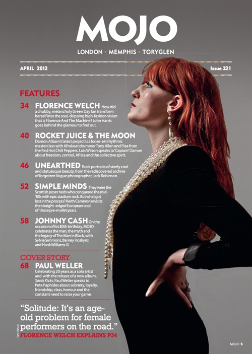
This is a contents page for the Music Magazine Mojo. It follows a constant theme that flows throughout all of Mojos contents pages. It has the Mojo title at the top centred. This instantly stands out to you and also obviously highlights that this magazine is from Mojo. Below the title Mojo there are three words in the iconic Mojo font and they read London, Memphis and Toryglen. I believe the font used is called True Type and it is very attractive and easy to read for people. The main Image is a mid-shot and it is on most of the right hand side of the page. There are three colours on this image and these help to make things stand out. On the image the colours are red (her hair), black (her dress) and white (Necklace/ skin tone). The colour scheme continues into the rest of the page. The numbers and the some important information are coloured in red and also the information and some titles are in white. The contents are shaped around the body of the main person in the image. This helps information stand out but also makes the image look more in place and helps to make it look better where it is. I think that this magazine is going to be aimed at people aged 15-30. I think this because the image used is of quite a modern person. I also think that this is going to be more of a feminine magazine. This is purely because of the woman in the picture. I like the way that the image shows her looking up, this is as if she is looking up and admiring the content of the magazine and the Magazine itself. It also looks like she is pushing herself into the magazine, attracting people to read it. Finally the date and issue number on at the top, one on the left and another on the right. There are also serrated lines bordering the date and issue number. There is also a little extract of the main article written near the bottom of the content page. This gives you an insight of what the main article is going to be like. There is then a page number so that people who want to continue reading this main article can find it in the Magazine. 

I like the way that they have put the text around her body. This helps to make the entire text stand out against the image and everything else going on in the content page. I also think that by putting a little extract of the main article that I am going to write it will make the magazine look more professional. Also this is quite a conventional thing to have on a contents page meaning that the contents page will look better.          

Thursday 11 February 2016

Analyse Front Cover


Hi, I am going to look at a different kind of Music Magazine. One that isn't as much linked to my main theme. The music magazine that I am going to be looking at today is one from Kerrang. Kerrang are more of a Hardcore/metal rock music theme.

One of the first things that really stands out on this Music Magazines front cover are all of the Dark colours. These are colours that I would associate with a Metal rock magazine. they link into the theme of the whole Hardcore rock music genre. I think that this Magazine is going to be aimed at the ages of 15-30. This is because I cant see generally someone under 15 listening and respecting Hardcore Metal music. I also don't imagine many people aged over 30 being interested in a magazine based on Hardcore music. I think that this Magazine is going to be mainly aimed at Male's rather than females. This is because of the Genre and the fact that there are a lot of Male's on the front cover. One thing that I really like about the Title of the Magazine is the fact that it has a smashed affect. The title is at the top and is centred. It almost feels like with the connotation of loud Metal music, that the loud music has smashed the title. This just shows the kind of music this magazine is advertising. The three main colours are Black, White, and Red. These colours all stand out effectively together and also link into the metal/ rock theme. Also the grey reminds you of metal which again links in with the theme. The main image is of a male. The most interesting thing I think he is doing is the way he appears to be looking down on the audience. This looks very good and almost persuades people to buy the magazine. There is also things like crude language. This is something that is against the normality of the magazine. But I guess this kind of Magazine is against the Norm of other Music Magazines. The first things that come to mind after looking at this Magazine are the words Loud ans Aggressive. This really reflects the genre of the music being portrayed.

I like the interesting title found on the Magazine. This is something that I might include. 

Wednesday 10 February 2016

Analyse Front Cover


I am going to have another look at another Magazine front cover that is conventional to my genre. Again I am going to be looking at a Mojo Magazine.


This is the second example Magazine. It is a great example showing a classic rock genre theme. The main image fills the whole of the front cover. This image include four people. It is the band the Beatles. These are an iconic band meaning that there is going to be a mass audience attracted. Also because they are a band that have been around for a while it means that older people could be attracted to read the magazine. I think generally this music magazine will be mainly aimed at an audience of 15-40 years old. I think that the main gender would be a 50-50 split between men and woman. This is because there is nothing on the Front cover that suggests it should be aimed towards one or the other gender. The facial expression of the four men is also very interesting. This is because wherever you look their eyes are always looking at you. This helps to make people instantly become engaged with the front cover. If someone was walking past there eyes would be drawn straight to the peoples eyes that are staring right back at them. There eyes are exactly where your eyes fall when you look at the four men. this is because they are all almost aliened just before the middle section of the Magazine front cover. Again like all of the Mojo Magazines that I have looked at there is a frequent colour scheme going on. This colour scheme consists of three different colours and in this case they are white, grey and black. Again like all of the other Magazines these colours help the text stand out and they all look good together. this will help to draw readers in. The Mojo title is located at the top and is centred. It stands out over everything else. I like the way that it is behind the main image making it blend in a lot more. The first thing that really stood out to me on this Music Magazine was the way that there eyes looked in the picture. All of there eyes were aliened and all looked like they were looking at you. I feel that this will help to attract people in. This is because they will feel like the magazine is starring at them. Again like on all Mojo Magazines there is a frequent colour scheme. I truly think that will help to attract people in and also it looks very good.  

Analyse Front Cover


The title on this Music Magazine is very affective to appeal to an audience. This is because it is in bold colours that stand out very well against a black background. It is also very big and stands out well. There are also 3D effects on the lettering that again help to make it stand out. The main colour scheme found on this Music Magazine is white, black and pink. These colours stand out very well together and help to draw people into the magazine. The main image in the middle is also very good. This is because it follows the colour scheme because it has a whitish affect to the image. The top of the image is just in front of the title meaning that the image stands out a lot. The rest of the information on the magazine page is in front of the image. I think that this Music Magazine could appeal to a wide age range from 15-40. The reason that the age range is so high is because it includes things such as David Bowie that will appeal to an older audience as well as a younger one. I think this magazine could appeal to both Male and Female audiences. This is because there is a lot of pink that would suggest female might want to read it but also there is a masculine feel to it. This is because of the picture of the man on the front. He has a confident posture which draws people in. I think lots of people would want this magazine because the main image isn’t intimidating. The image is looking at you and almost inviting you to read the magazine. I think one of the main things that I am going to take from this Magazine is the use of three main bold colours. This is because it helps information stand out and helps things to stand out. I also want to use a Male person on the front cover because I think that it will appeal to both genders.


Introduction


This is my blog and I am going to be showing how I made my Music Magazine. I am going to be making a Preliminary Magazine and then finally a Music Magazine. I will use the Preliminary Magazine as a first attempt. This will mean that when I come to make the magazine I wont make any mistakes or errors that I might have made in the Preliminary. Once I have done the Preliminary task I will then start doing some research into different music magazines. Here is a mood board showing the kind of Music Magazines that I am interested in. The genre is a kind of Classic Rock\ Indie theme.


Tuesday 9 February 2016

Preliminary Task


This was my front cover for my Preliminary task. The task was to make a school magazine with conventional features. As you can see there is a main image which is a medium close up. This stands out very well and helps to attract people to read the Magazine. There is also a mini image on the bottom right corner. this again is something that will help to attract people to read the magazine. The title was also in a good place because you could see it easily and also it stands out against the white background. I had the school logo on the top left right side. This again stood out for people. Something that was suggested to me was that I hadn't really thought about where I was placing the text. It was suggested that the text was just placed in random places without thinking about where i was putting it. Next time I will definitely think about where things are going. I was also told that the background colour is a bit plain and boring. I will definitely have to think about the background colour and will have to make sure that it looks good.


This is the Contents page of the music magazine, the preliminary task. I think this was better than the front cover because it got better reviews than the front cover. As you can see there are three different pictures going down the left hand side. I think that these stand out and are very effective to attract people to the content page. They are all of different things and one them has been cut out using Photoshop. This shows that I know how to use it. Also all of the information is written next to the images. These are then surrounded by blue circles helping them stand out and also following the colour scheme. I also have the title "Content" at the top. This is again coloured the blue like everything else. Again I have been told that the blue isn't the most attractive colour and doesn't look very good. When I come to make my Music Magazine I will definitely think of having a better colour scheme.