Tuesday 3 May 2016

Final Post

I have now completed this whole Media Task. The Music Magazine is now complete and I have really enjoyed the process. All of the work has lead up to completing the Music Magazine and I am happy with what I have created.

Thanks for viewing my Blog!

Evaluation (PowerPoint)

This is my Evaluation PowerPoint.


Final Cut

I have now made all of the required changes meaning that my Blog is now complete. This has been a long process and all of the initial work has been completed which lead up to this final product. This helped the final product to look good and professional. I will now show them and talk briefly about them.

Final Cut Front Cover:


This is my Final front cover. As you can see a lot has changed and I have improved the vast amount of it. I changed the main background colour. Originally it was purple but I have changed it to a light grey colour. This meant that it was easier to read against and made it a lot more conventional. Also the main image is different and new making it a lot more conventional and professional. I have also changed the layout. This new layout looks very professional and conventional. I think that this final cut is a lot more conventional and meets what my target audience wants. This is because it was designed using conventional features. I then added more fonts to make it look more attractive. 

Final Cut Content Page:

This is my final content page. As you can see I have made a lot of changes to it. These changes have helped to make it look professional and conventional. I had changed the background colour to the same background colour found on the front cover but then I changed it to just blank white. This was because I thought that information was easier to read against the white background. I also made the layout similar to the layout found in a Mojo Music Magazine. I changed the image to one from the outside and also I made it fill the whole of the right side. I also added an extra content because that was conventional and something that I saw in my research. 

Final Cut Double Page Spread:


This is the final double page spread. This is a very good final draft because I have included a lot more conventional features. I have changed the layout because the previous one didn't have a good layout and didn't work very well. I also changed the main image. This was because from the research that I had done I found that only one image should be used. I also found that the image should fill the majority of one of the side's. I then improved the article and made it flow better. I then finally added in a title to the article making the article look professional. It was also something that was supposed to be included. I then added more fonts to make it look more attractive.    

I have now created a professional final cut of the Music Magazine. It is probably the best possible piece that I could produce. All of the research has helped me get to this point and I have learnt from previous tasks how to make it the best. 


Monday 2 May 2016

Target Market Feedback

I have put together a interview. I was interviewing a member of my target audience. I asked them what they thought of my original Music Magazine and there opinion on my new Magazine with all the changes.


Thursday 28 April 2016

Final Content Photo

I have know chosen the Content photo that I am going to use. This meant that I am able to do some Photo manipulation to make the photo look better and more conventional. The final Photo is:


This is the Final Image that I am going to use for my Content Page . I did some Photoshop to make it look better and more conventional. The first thing that I did was cropped the image. This was because there was a lot of background that I didn't want in the Image. I also added some brightness to the image which meant that it was more visual for people. I then added some saturation to make the model look better. This is the final image that I will use on my Content page.  

Wednesday 20 April 2016

New Content Photo Shoot

These are some of the new images that I have taken for my Content page. As you can see, I followed the idea of taking the pictures from outside. I think that these pictures look very good and are professional. They will help to make my Content page look better and more conventional for the Music Audience. I will know pick one of the images and then will do some Photo Manipulation. By doing the Photoshop it will make the image look better.   

Monday 18 April 2016

Content Page Photo Idea

After speaking to some people from my Target Audience, they said that a new Content page photo should be taken. This meant that I had to start getting some ideas and inspiration. This is because I want my Magazine to be conventional and fit for purpose. After looking around I found this content page from Mojo Music Magazine.


The reason why I have picked this Content page is because I like the image and I like the way that it is outside. I think that my Content page is going to have a image with a outside background. This wont necessary fill the whole of the page, it might just fill part of it.

Front Cover Edits

I have made some updates and Edits to my Front Cover to try and make it more conventional and fit for purpose. I did this by looking at the Front Cover's from the research that I did.


As you can see, on this Front Cover there are a lot of different stories on the front cover. This is the conventional thing to see on a front cover.


This is the new edit of the Front Cover in design view. As you can see I have added a lot of new boxes. This meant that I could write in them adding in more text.


This is the Front Cover. I have added more text, like I saw on the Front Cover that I researched. I also noticed that my researched magazines had a little bit of information about the CD in the bottom left of the Front Cover. I also added this in. Finally on the Front Cover's that I looked at I noticed that there was a Plus. This told readers what and who were featuring in the magazine. I also added this on my front cover.

Friday 15 April 2016

Influence


I have recently taken a new Front Cover image. This was influenced from  Mojo Music Magazine that I recently had a look at. The Music Magazine is:

This is the front cover that I had a look at. As you can see my Front Cover image was influenced from this front cover. I liked the way that the model in the background had a guitar over the shoulder. I thought that this looked conventional and professional for my Music Magazine. The image I took is:

  
This is the image I took which was inspired from the Image seen on the Front Cover of that Mojo Music Magazine.

Thursday 14 April 2016

Change of plan

I have recently stated that I would be adding new images into my Double Page Spread. This was because I needed some more pictures to make the Music Magazine look more attractive and more appealing to people. But after looking through my research I found that adding images wouldn't be conventional to what I am replicating. I am looking in depth at Mojo Music Magazine or Classic Rock and after looking back through my research I found that usually, only one main image is locate on a double page spread.

For example:


This Double Page spread from my research only contains one image. So I am going to try and only use one image in my Double Page Spread to try and make it as conventional as possible.

Update


I have know made massive changes with my Music Magazine by implementing the new ideas that were suggested to me. This has made my Magazine look better and a lot more professional and conventional. It has been good because the magazine has improved massively but also there are new features which has made the magazine look effective and stylish. This is good and the work I have done has been successful for my magazine.

But in the future I will be making some edits which will hopefully make my Music Magazine better. These are little things that will allow a wider audience to be attracted to the magazine. Firstly I need to add in two more images in my double page spread. This will give the audience more of a view of the star and also there is more there to attract people to read the magazine. Also I think that I need to add more text onto the Front Cover of the Music Magazine. This is because in my research I saw that there was a lot of information on the front cover. For example:


This Music Magazine from my research has a lot of different pieces of information on the front cover. I need to incorporate some more information to make my Music Magazine more conventional and fit for purpose.


Also I am going to add in more stories in my Content page. This is because when I looked back over my research I noticed that there were at least five stories. Such as:


This Mojo Magazine has five different stories as well as a cover story. This shows that I have to include one maybe two more stories to make my Music Magazine effective and conventional.


These are some improvements that I will be making too my Music Magazine. These will hopefully make my Music Magazine look better and more conventional.

Wednesday 13 April 2016

Update of Magazine progress

I have made some work to my Music Magazine which has made it look better. A lot of these changes were suggested to me by member's of my target audience. What I have produced isn't the final piece and changes might still be made to make the Music Magazine better and more professional.

Front Cover:


This is the Front Cover so far. As you can see I have changed a lot of features on this Front Cover to help make it better. The first noticeable thing is the background colour has been changed. I changed it to more of a softer colour. This was suggested to me but also I think that it is less distracting. I have also moved thing's around to make them fit in places better. There are also some new fonts which means that there is more of a variety for viewer's. I also put borders around some of the images to help them stand out more and to make them look better. The new images have also been implemented.

Content Page:


This is the Content page that has been produced so far. There are new features added onto this Content page which help's to make it look better and fit for purpose. Again I have changed the background colour to the same as the front cover. I have also made the contents more like some from my research. I saw these in the Mojo Magazines so decided to implement a white background. Also I have put a red line across the top so that it stands out. Within this red line is the months issue. I have included new images onto the Content page as well as a familiar one. This has been moved from the old double page spread.


I have made some changes to my Music Magazine Content Page according to this Mojo Content page. This Mojo content page includes a lot of good features and what I liked was the way the stories had a white background. This is because with the colours used in my Magazine and this Magazine it looks good. Also I think that it will help to make the Magazine look fit for purpose. Also I like the red line that has the date and issue number in. This again adds to the magazine and looks conventional.  


This is where I got some of my inspiration for my new look content page.

Double Page Spread:


This is the Double Page Spread so far. As you can see the background colour is still white. This is because I think a white background looks good for a double page spread. The main text is know all on the right page. This means that it is easy to read and also it looks neat in the columns. I have moved the quotation box within the text. This is something seen in the research that I completed and I think that it looks professional and good. The new image has also been implemented. I have added in the name of the interviewer and also the title. I am still waiting to implement two more images into the blank squares.

Wednesday 6 April 2016

Photo Manipulation

I have know taken some new Images for my Music Magazine. I want to make them better by doing dome Photo Manipulation. This means that I am going to edit them using Photoshop. This is good because it means that they will look better and more professional for my Music Magazine.

Main Content Image:


This is the original image. Know I think that it looks good but it could be made to look a lot better using Photoshop.


The first thing that I did was to take out the background. This was because it was something that I didn't want to have or didn't want to use. I wanted the image to have a clear transparent background so that it could go against any background on my Content page. I cut it out using a mask. This was because I wanted to cut it out smoothly. I also added some saturation so that the image looked better and brighter. This image will know be used on my Content page.


Front Cover Image:


This was the original image. I like it just I think that it can be made to look better and more effective.


This is the newly edited image. Again the first noticeable thing is they way that I have removed the background. Again this was done using the mask tool. Again I wanted the image to be cut out smoothly so that it would look more professional and accurate. I then cropped the bottom off. This was because I only wanted the knees up. I again then added in some saturation so that the image looked better. This image is know ready to go in my Music Magazine. 

More Images

I have taking some more images of another model. This was because I wanted another model in my Music Magazine but also I wanted more images in the Music Magazine.

Main Content Image:


This image is going to be used in the Content page. I took this image because I wanted to have a model with attitude and also I wanted to nave him looking at the camera. I also took it as a medium shot, this was so that I could see the chest up. This was good because it meant that I could see a fair amount of the model. I used head phones as a prop to make the photo more interesting. This is a photo that I will be using for a Content page.

Front Cover Image:


I also took this image. This was so that I could include more images on the front cover which was what my target audience wanted to see. I had my model crouch down so that I could have a lot of the body in a smaller image. I think that this looked very good and also looks conventional. I think that this image will be used as a small image on the front cover. This will look very good and professional.

Photo Manipulation

I have know edited some of my Photos making them better and a lot more professional for my Music Magazine. This is good because it means that my Music Magazine is going to be a lot better and a lot more professional. I will list the image and then put the new photo manipulated image next to it. This will show people the difference. I will then explain what it is that I have done so that people know exactly how and what I did.

Main Image:


This was the original image before any work had been done to improve it.It is a good image but I think a bit of editing will help to make it look a lot better.


This is the Image once I had done some work on it. As you can see the most obvious thing that I have done was to remove the background from the image. This was because the background wasn't good and I wanted it done. To remove it I used a mask. This was because it was a lot more smooth than using the select tool. I also used a spot healing tool to try and make the model look better and more appropriate for a Music Magazine. I think that this made the image look a lot better and more professional. I then finished it by adding some saturation to the image. This again helped to make it better and more presentable.   
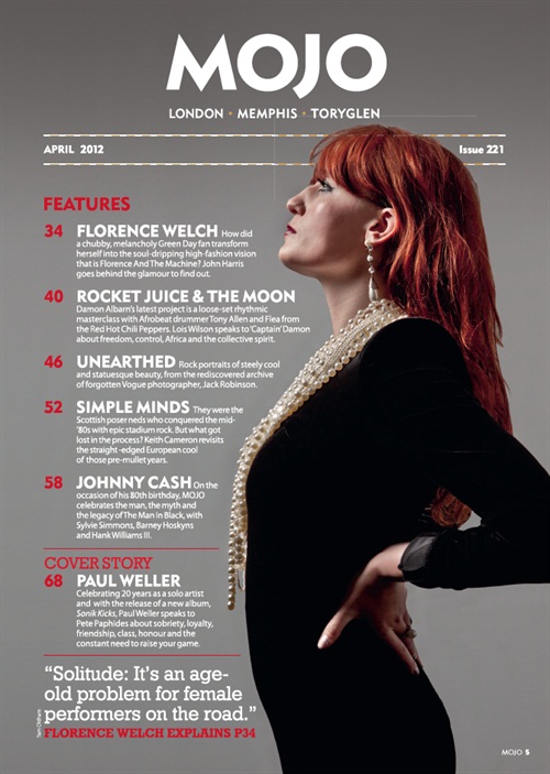
Front Cover Image:


This was the original image that I thought looked the best. But the only problem was the way that it didn't look very presentable and didn't look too professional. I did some editing to make the image look better and more professional.


Again as you can see I have removed the main background that was on this image. This was because I didn't want the background there any more. I wanted it to be plain without a background behind it. I think that it helped to make the image look a lot better and more professional, making it a better image to include on the Music Magazine.I cut the image out using a mask again. This was because I think that it looks smoother and also was a lot easier to do I also made the image a bit brighter so that it could be seen better and that it looks better. This is all I really did for this image but I think that what I did was enough to make it look good and professional. 

Double page spread image:


This was the image that I decided to use for my double page spread. This was because I thought that it looked the best and also I liked it the most. I will do some photo manipulation to make it look better and more professional.


I have made this image look better thanks to Photoshop. This is good because it means that the double page spread will be more appealing to audiences. The first thing that I did was gave a red shadow to the image. This was because I saw an image with a shadow in my research and I made it red because this is a colour that my Music Magazine uses. Also I cropped the image so that more of the model was in it and less of the background. This I think helped to make it look better. It also helped to make the image look bigger which helped to make it look a lot more professional. This is the image that I am going to use on my magazine. 

Wednesday 23 March 2016

New Photos

I have know taking some new Photos that I might use in my Final Music Magazine. I will have a look at them and see if they look good in my Music Magazine. I am not saying that these will be the ones, and will be the final images, I just wanted to try out some ideas and see what works and looks good. 

First Set of Images


I have asked my model to hold the guitar as if he were playing it, but I still wanted him to interact with the camera. I only wanted the top half of the models body so I used a mid shot to get the guitar and also the face in. As you can see I have experimented with different facial expressions to see what looked good. I was thinking that this kind of image could be used on the front cover as a mini picture of a side act.  

Second set of images


I need a new Front cover main image so decided to take some new ones. I asked for the model to hold a acoustic guitar over his shoulder and to look directly into the camera. I also wanted the model to be almost leaning back, slanted a bit. I think that this again helps to add in more attitude which is what my target audience wanted. Again I used a mid shot so that most of the body was included. I experimented by asking my model to stand on different sides to see which looked better. 

Third Set of images
   

I decided to take some pictures of the model outside, this meant that I had a background that I could actually use in my Music Magazine. These images were ideas for the double page spread. I had the model standing in different positions and looking different ways. Although not all of the images were in focus I think that this is a good idea and I think that I will retake some of the images and see if they look better. 

I will have a look and see if the images look good in the Magazine and if not I will take some more.